PRODUCT DESIGN / UX / UI
___
Restore for Retail
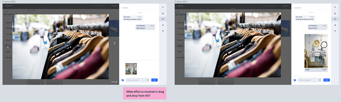
Photo markup tool
Who is Restore?
Restore is a young Saas product that has a handful of retail customers such as JB Sport, JAG, Sportscraft who are using Restore for their retail operations. For these retails who have multiple stores, need to make sure they’re consistent and at a standard they expect.
My role
Working closely with the cross-functional team primarily on the mobile app focusing on the visual merchandising flow across the mobile native app and desktop web. I helped improve some key features which were vital in helping Restore customers complete some important tasks.
Tools used

Key gap in the experience
The ‘feedback loop’
A core use case involved retail stores receiving instructions for campaign setups, such as posters and window displays. The visual merchandising team created setup instructions, which store staff then implemented and submitted for review.
Ideally, staff would use Restore to capture photos, receive feedback, and make revisions, creating a continuous feedback loop.
However, early insights suggested this feedback loop was not working effectively and was breaking down in practice.
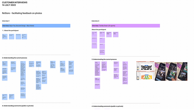
Speaking to customers
We spoke to customers to validate our assumption that the feedback loop was broken and to better understand their workflows, pain points, and opportunities for improvement.
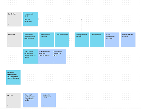
User needs + business objectives
Together with the Product Owner, we defined clear goals for closing the feedback loop to align the team and guide design decisions.
Business objectives
- Increase user engagement within the Restore app
- Reduce reliance on external communication tools
- Increase product value by making workflows more efficient and complete
User goals and needs
- Make it easier and faster to give feedback
- Improve clarity and quality of task feedback
- Increase confidence when sharing and receiving feedback
Success metrics
Increase in completed feedback loops
Increase in use of photo markup features
Increase in comments and in-context feedback on photos
Success metrics
We defined success as:
- Increased completion of in-app feedback loops
- Increased use of photo markup tools for annotated feedback
- Increased comments and contextual feedback on photos within tasks
- Reduced reliance on external channels (e.g. WhatsApp and phone calls) for task-related communication
We evaluated success using qualitative feedback, internal team observations, and visible behavioural changes in how users engaged with the workflow, rather than detailed product analytics.
Prioritising features
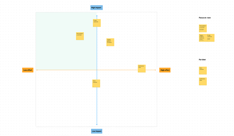
Impact over effort
Led a session with the team to help us figure out the most important things to focus on first.
Design Prioritisation
Prioritising some of the key tasks for version 1 - breaking down some of the small things we can do now and try and leverage what we have - reusing some of the functionality and components in Restore.
Mapping out flows
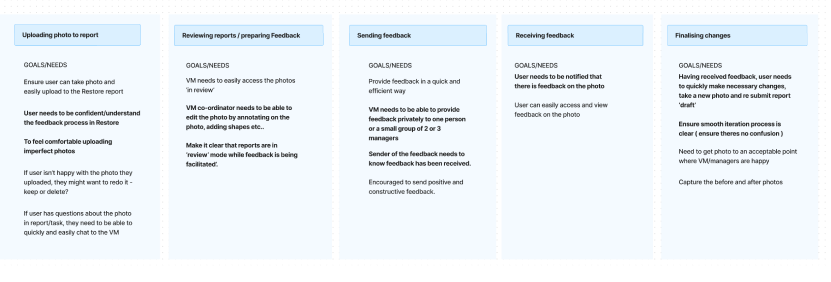
To get our heads around the users workflow, I mapped out the desired journey and noted the user goals and needs at each stage.
We then identified the areas we should focus on which would address the ‘feedback loop’.
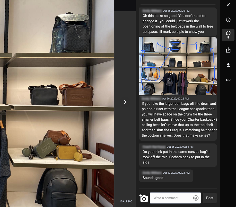
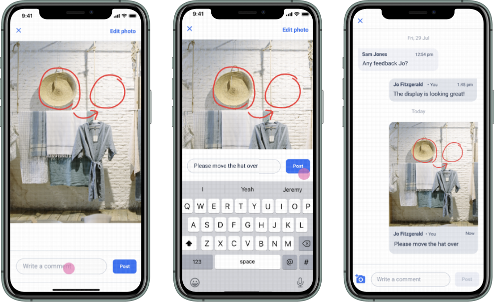
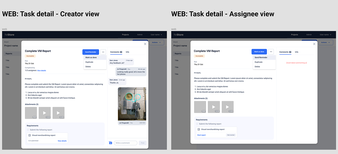
In this screenshot we can see a real customer has marked up the original photo and posed it in the comments thread to keep that feedback in the app and contextual.
Outcomes
The marking up photos and posting in comments’ was probably the most important feature in relation to the whole feedback loop work. It was implemented and immediately VM users were using this feature.
The core goal of keeping users in the app at this stage of their workflow was accomplished. Other apps like WhatsApp were taken away from their disjointed workflow.
- Users increasingly stayed within the Restore app to complete feedback rather than switching to external tools
- Photo markup and in-app commenting became more commonly used for task feedback
- Feedback felt more continuous and contextual within the workflow
- Internal teams reported fewer instances of fragmented communication across WhatsApp and phone calls
- Overall experience was seen as more streamlined and less disjointed
Refining the experience
UI - accessibility and usability
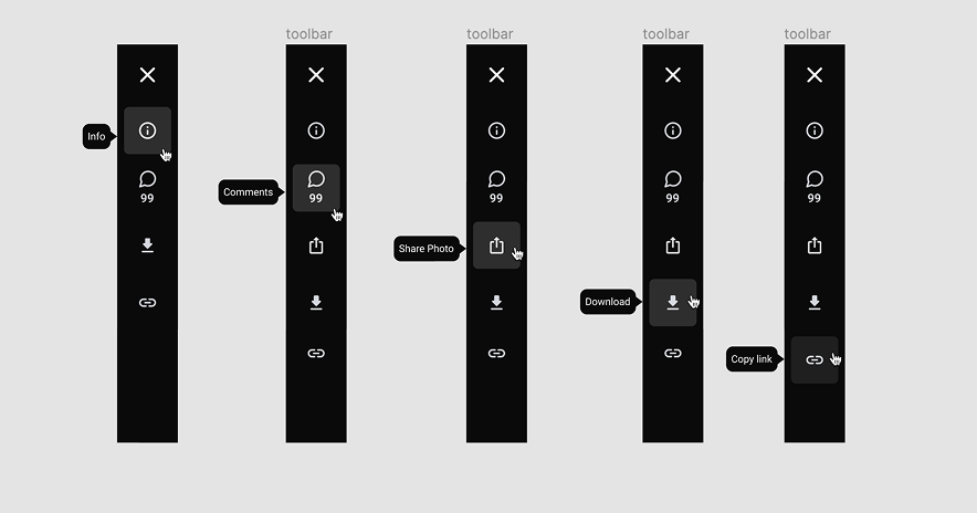
Introduce hover tool tips to the vertical menu bar to help with identifying the menu action.
Improving the task modal view - incorporating comments.
...
Consistent UI across multi platforms
...
Adding to the design system/ updating and introducing new components
...
I’d love to chat about how I can help you. Say hi over email.