PRODUCT DESIGN / UX / UI
___
Restore for Retail
Retail SaaS platform
Who is Restore?
Restore is a SaaS platform that helps organisations manage tasks, communication, and operational workflows in a centralised system. It enables teams to assign, track, and complete work across distributed environments, improving visibility and coordination between managers and staff.
My role
I was brought in as the lead UX/UI designer on Restore’s
SaaS product. I was responsible for:
- identifying usability issues and UI inconsistencies
- redesigning key workflows
- introducing new features
- contributing to the evolution of the product’s design system

Tools used
Project snapshot
I worked as a UX/UI designer within a cross-functional agile team on Restore for Retail’s SaaS platform, designing new features that supported communication, collaboration and day-to-day operations for retail teams.
I focused on improving usability and experience, ensuring the newly migrated platform reached feature parity with the legacy system while identifying quick wins to further enhance the overall experience.
I also introduced some important new components and design patterns, refined the UI, and helped establish a more consistent and cohesive design across the product.
Impact and outcomes
After releasing some key features which helped users with task management and communication, there was early post-release feedback and usage data indicated strong adoption and improved usability across these features.
- Recurring tasks were adopted by approximately 60–75% of brands using the platform
- Task comments became a widely used communication method between managers and teams
- Improved task visibility increased efficiency for senior managers and customer success teams
- Early feedback highlighted improved clarity, ease of use, and faster task completion
"Now we can see details easily, filter to the date range we need to check, easily see completions or if there any comments”.
Overall, while still early, the updates have been well received, with clear signals of improved usability, adoption, and day-to-day efficiency.
Reflections on measuring UX impact
- Conduct user research to validate improvements through direct observation of users completing end-to-end tasks, identifying friction points, confusion, and failure points in real usage.
- Establish a baseline of task success by understanding current completion rates and where users experience difficulty within key workflows.
- Iterate on designs based on research insights and usability findings.
- Re-test solutions to evaluate improvements in task completion, efficiency, and user confidence.
Design objectives
- Identify and resolve critical UX issues to improve core usability
- Redesign key workflows to simplify task management and improve efficiency
- Design and deliver key features supporting core user needs and introduce new UI components to support the feature
- Establish foundations for a consistent and scalable design system
The problem
At Restore for Retail, store associates and managers were struggling with complex workflows around task management and communication.
The experience was not intuitive when managing and tracking ongoing work, which created friction in day-to-day operations and reduced efficiency and adoption across teams.
Key problem areas included:
- Lack of visibility over task progress across teams and locations
- Fragmented task communication across email and external channels
- Inefficient recurring workflows leading to unnecessary manual work

Who we're designing for
To ensure alignment across the team, we developed proto-personas early in the project based on input from stakeholders and customer-facing teams.
These helped establish a shared understanding of key user groups, their goals, and the tasks they were trying to complete within the platform.
While initially assumption-based, these proto-personas provided a practical foundation for early design decisions and were progressively refined as more user feedback and behavioural insights became available.
I used AI tools to quickly generate initial proto-personas, which were then refined with the product owner to better align with real users. These provided a shared foundation for the team and were intended to evolve through ongoing user research.
Approach
I worked closely with the product owner, customer-facing teams, and engineering to identify key user problems and prioritise improvements.
My approach included:
- Aligning on priorities and requirements with stakeholders
- Input from customer success teams to understand real-world user pain points
- Scenario mapping to clarify user goals and edge cases
- Rapid prototyping to explore and validate solutions
- Iterative feedback sessions with stakeholders and internal teams
- Technical collaboration sessions with engineering to ensure feasibility
- High-fidelity UI design with detailed interaction documentation
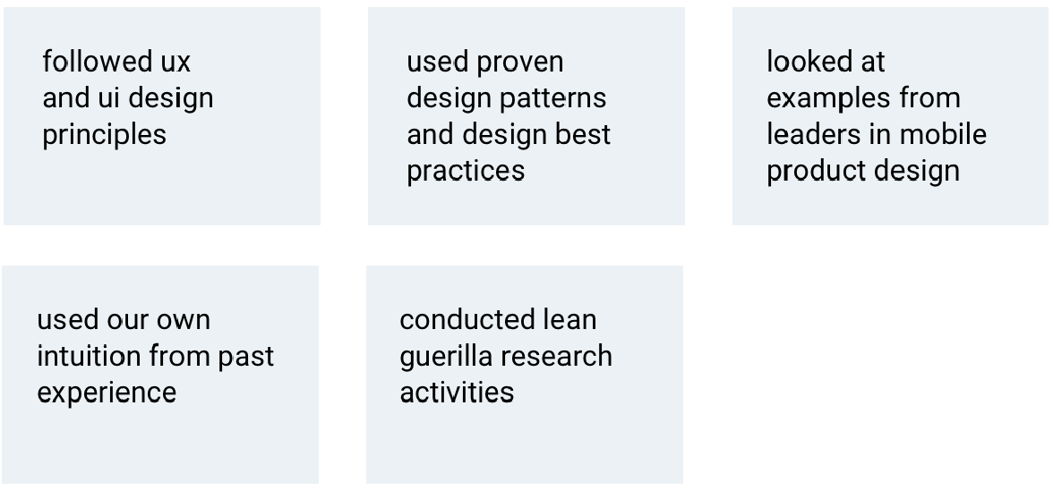
Five core reference points that guide my design decisions

Key problems and how we solved them
Through mapping key user flows and collaborating with the product owner and customer-facing teams, we identified gaps and prioritised the most impactful areas to address.
1. Lack of visibility over task progress
Managers had limited visibility into task completion across teams, making it difficult to track progress at scale.
Solution:
Redesigned task views and assignee interfaces to surface progress, completion status, and overdue tasks more clearly.
2. Fragmented task communication
Communication about tasks was spread across email and external channels, reducing clarity and accountability.
Solution:
Introduced in-platform task comments, enabling contextual communication directly within each task.
This feature quickly evolved beyond its initial intent and became a core communication tool between managers and teams.
3. Inefficient recurring workflows
Users were manually recreating repetitive tasks, leading to inefficiencies in daily operations.
Solution:
Designed recurring task functionality to reduce repetitive admin work and streamline workflows.
Design system & UI consistency
Alongside feature work, I contributed to improving UI consistency across the platform by introducing new components and refining existing patterns.
I helped evolve a more unified visual language through a style tile and expanding component library, laying early foundations for a scalable design system.
UI style tile


Handoff and delivery
I worked closely with engineering to ensure smooth delivery of designs by providing:
- Detailed UI specifications and interaction notes
- Interactive prototypes for clarity of behaviour
- Clear screen flows and component documentation
- Regular technical check-ins to validate feasibility
- QA support during implementation and release cycles
UI spacing
I’ve always been particular about spacing along with other important visual design elements, treating them as a core part of interface design rather than an afterthought.
I defined clear spacing specifications and guidance to ensure consistency across teams and implementation, including:
- Establishing a consistent 8px spacing system
- Supporting a unified, minimalist visual language across the product
This helped create a more cohesive, scalable, and balanced UI, reducing visual noise and improving consistency, alignment, and overall design clarity.

Reflections on measuring UX impact
In a role with more time and capacity for ongoing user research, I would have validated improvements through direct user research, observing users completing tasks end-to-end to identify friction points and establish a baseline of task success by understanding current completion rates and where users experience friction, confusion, or failure. I would after iterating, re-test to evaluate improvements in task completion, efficiency, and user confidence.
Refining the experience
Prototyping - refining & iteration
Creating quick prototypes helped showcase how the screens fit together in context and helped demonstrate interactions. This was helpful in showing a specific part of the journey and obtaining beedback to help inform design and then iterate further.
Scenarios: aligning features with user Goals
Some of the features had complex use cases, so creating scenarios for each one with the PO was important to help everyone clearly understand the purpose and what the user needed to do.

Designing for completeness and engagement
Considered edge cases such as empty states to guide users and encourage engagement. Subtle moments of feedback and guidance were introduced to support first-time interactions, such as prompting users to contribute to task discussions.
Exploring AI opportunities
Integrating AI into the Restore product became a key focus on the roadmap. I began exploring ideas and created high-fidelity screens with the aim of gathering feedback and validating concepts with users.


I’d love to chat about how I can help you. Say hi over email.