

UX / UI / PRODUCT DESIGN
VicSuper
Superannuation
New members app
My role
Working in a small Agile team on the native VS app from early stages to first MVP release.
I was responsible for the UX/UI and interaction design throughout the project in collaboration with the UX manager and other team members. I helped design a product sympathetic to the users needs by following a human-centred design approach as much as possible while also balancing technical limitations and business driven objectives.
Outcomes
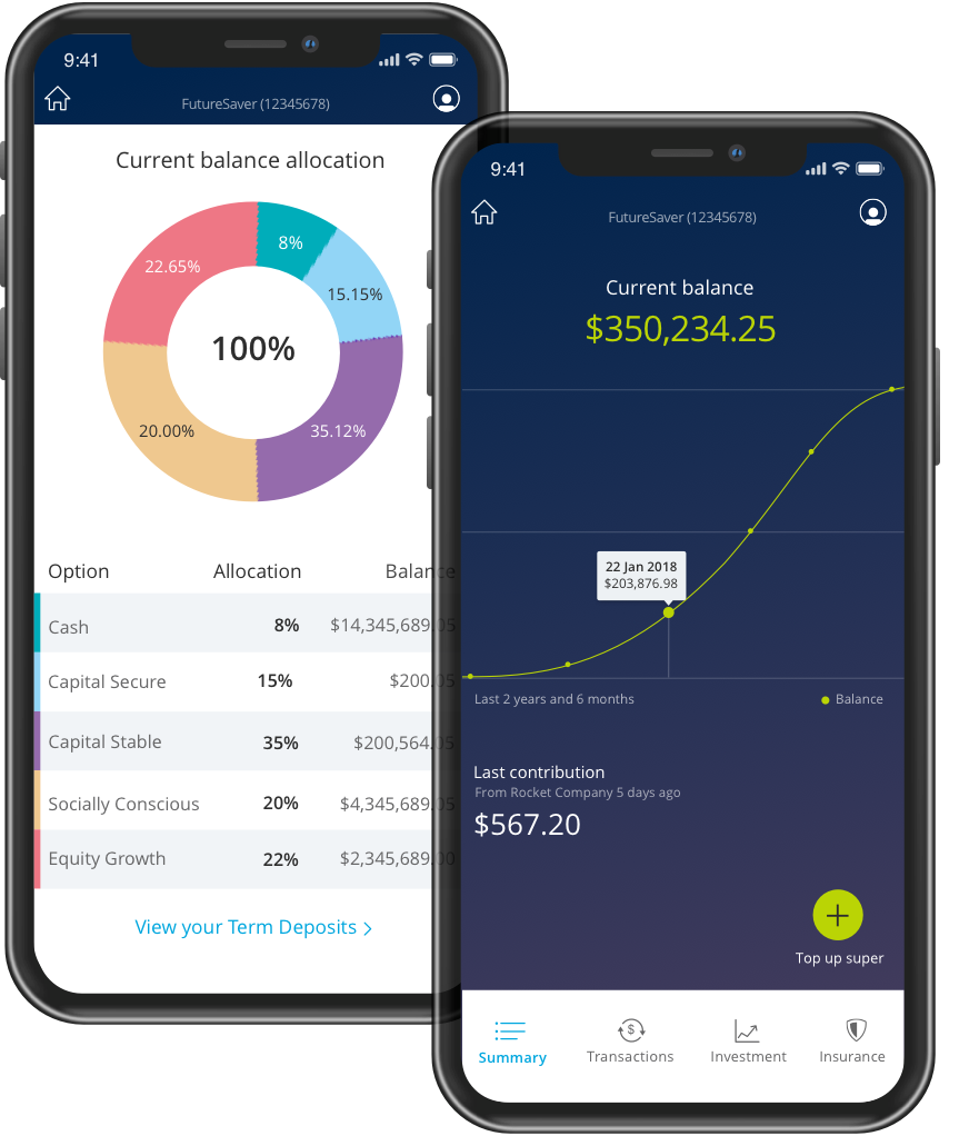
The new mobile app improved the clarity and usability of complex superannuation information, helping members more easily access and manage their accounts.
- The new mobile app improved the clarity and usability of complex superannuation information, helping members more confidently access and manage their accounts.
- Establishing a cohesive and scalable UI language improved consistency across the product experience and helped lay the groundwork for a more maintainable and extensible digital design system.
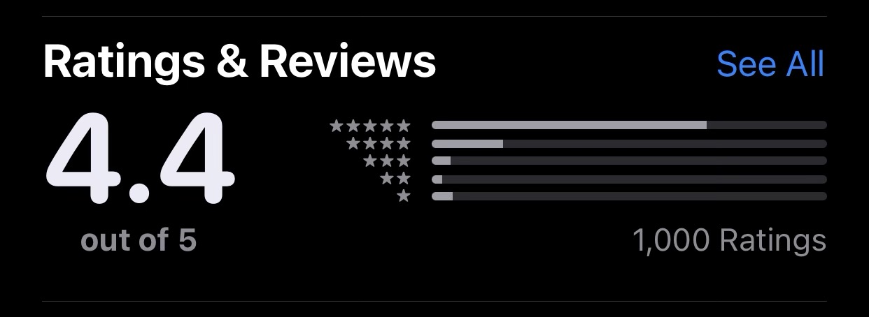
- Shortly after launch, the app received an App Store rating of 4.4 stars, providing early evidence of strong member reception and positive user sentiment.
- The simplified interface and clear information hierarchy reduced friction across key member tasks and contributed to a more modern, user-centred digital experience.
The challenge
VicSuper was behind competitors without a mobile app, limiting engagement, particularly with younger, digitally savvy users.
Managing super was already complex and disengaging, and the desktop experience was not supporting quick, accessible interactions.
The problem we were solving was to create a mobile experience that made super easier to understand and engage with, while helping the business stay competitive and improve member engagement.
Tasks and deliverables
- Task flows
- Sitemaps
- Schema diagrams
- Low fidelity wire frames
- Interactive prototype
- Usability testing
- High fidelty UI mockups
- UI and interaction design specifications.
Tools used

Design approach
A Human Centred Design approach was central to the work, although it can be challenging to fully embed in organisations early in their UX maturity.
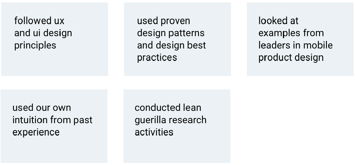
To guide design decisions, we relied on these five consistent reference points:
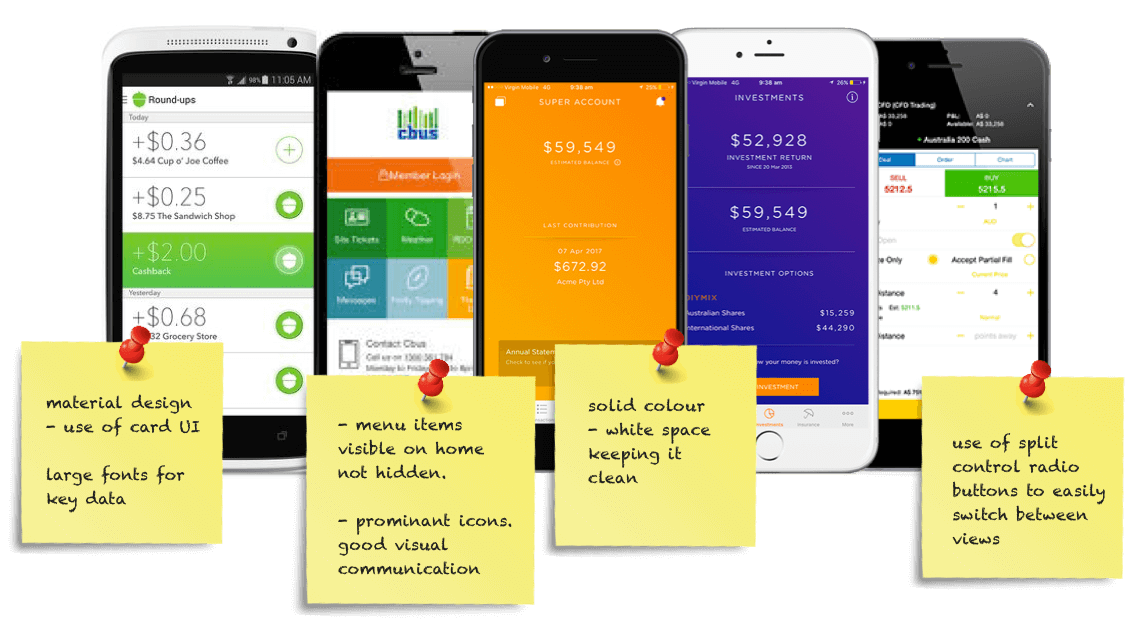
UI research/ competitor analysis
We looked at competitors features, user/ interaction flows, UI and visual styles to see what others in the superannuation space were doing. We wanted to leverage good design patterns and learn from the bad stuff to help us create a great experience for the app.
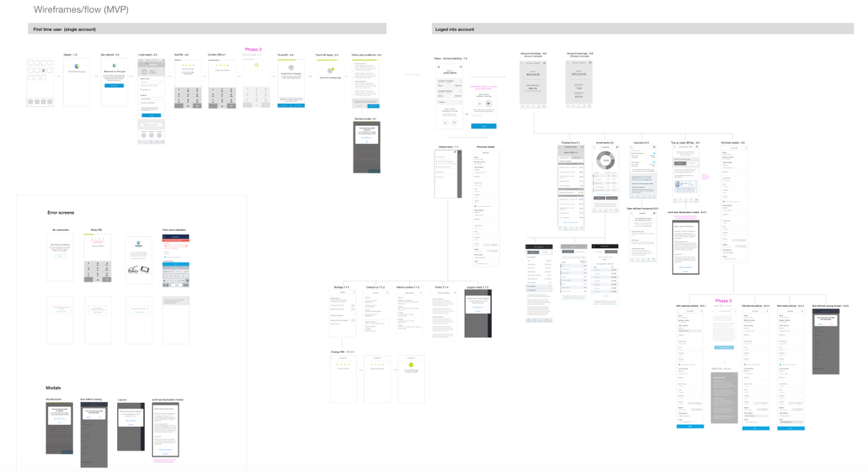
Schema diagram/ wireframes
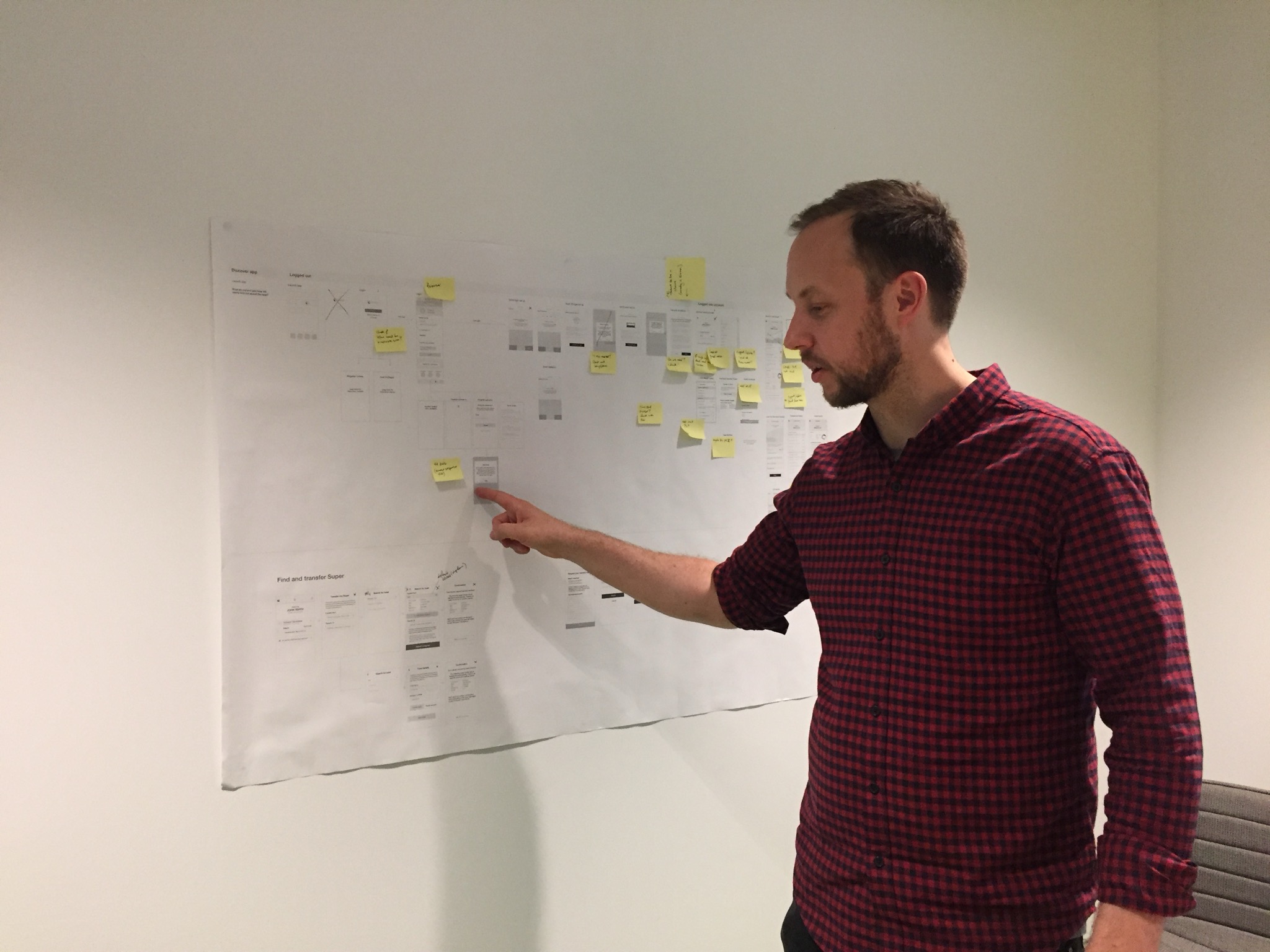
Low fidelity wire frames (phase 1 MVP) showing the holistic flow and view at the beginning of the project. As the project progressed, more scenarios and wireframed were created, and I lalso looked at flows for notifications to put in the backlog for phase two.
Sitemap and IA
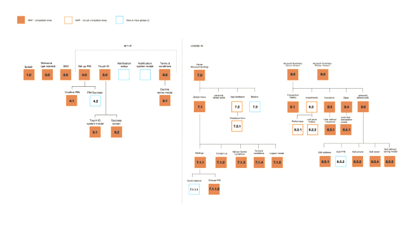
Creating a sitemap was important so we could make sure that the information architecture made sense. It also helped the team easily keep track of and identify what screens were missing / needed to be completed.
Test, learn and iterate
Quick ideation and problem solving
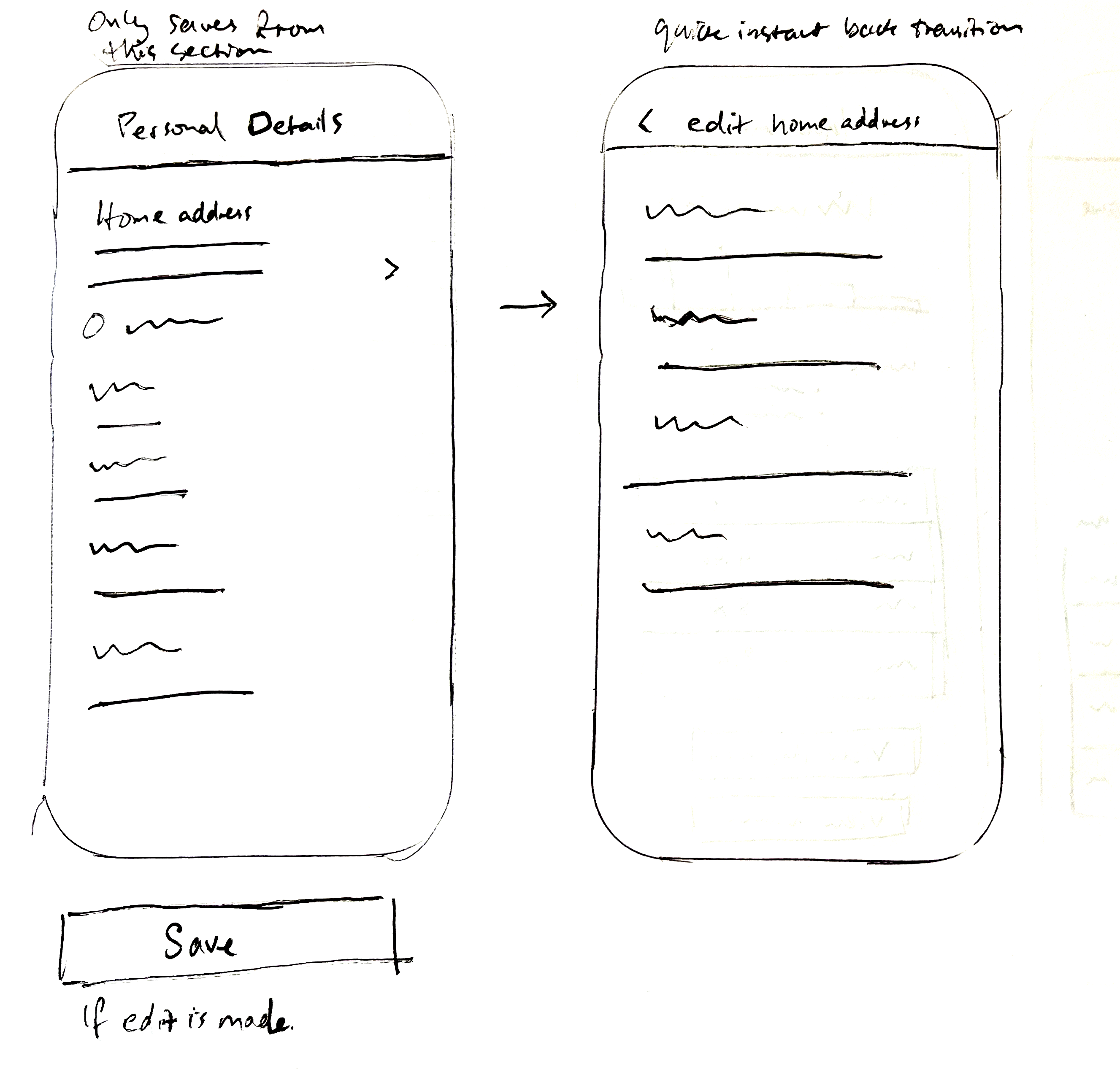
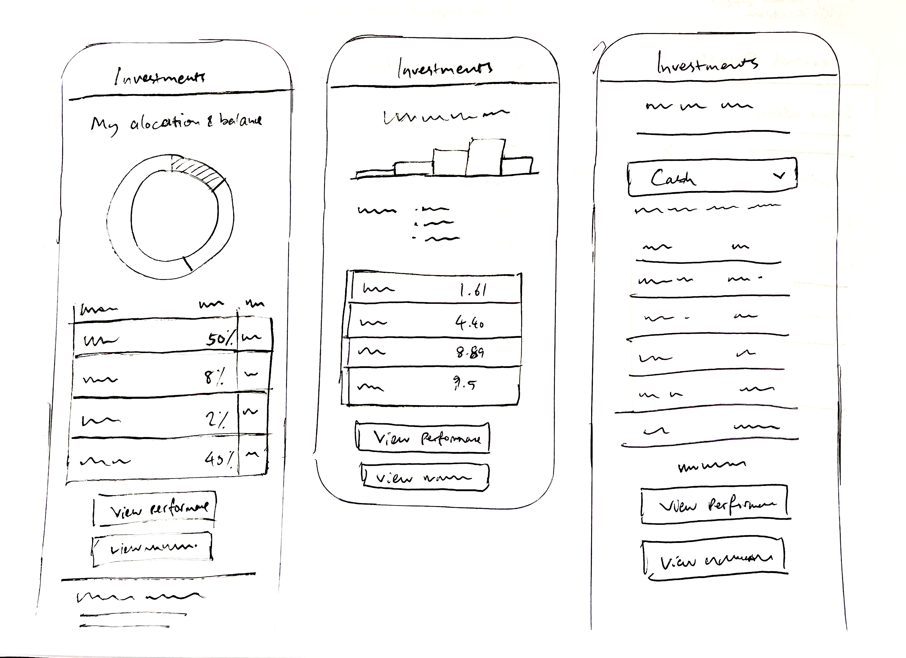
Quick ideas through sketching were cruitial for some of the more complex screens and interactions before jumping into higher fidelity wires. Collaborating with the UX manager and other members of the team was important so we could move quickly through the process.
Team collaboration and design rationale
Continuous collaboration with the team and stakeholders was critical throughout the project. Regular discussions helped align business, technical and user needs, while also providing opportunities to explain the thinking behind design decisions, gather feedback early and iterate quickly as the product evolved.
Low to high-fidelity prototyping
A high-fidelity prototype was also created to showcase designs to the team and help demonstrate flows and interaction patterns to developers. It also allowed us to validate designs with users and gather quick feedback before development and release to production.
Usability testing
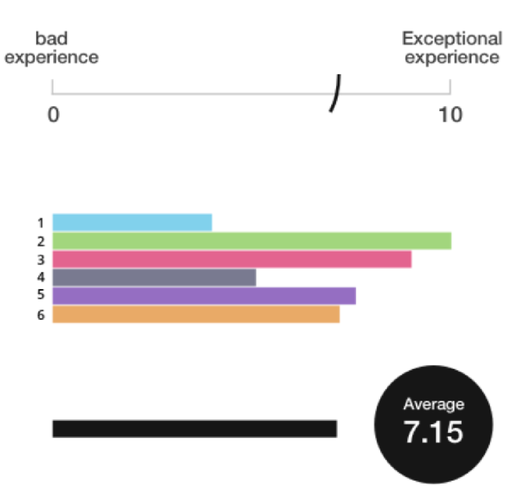
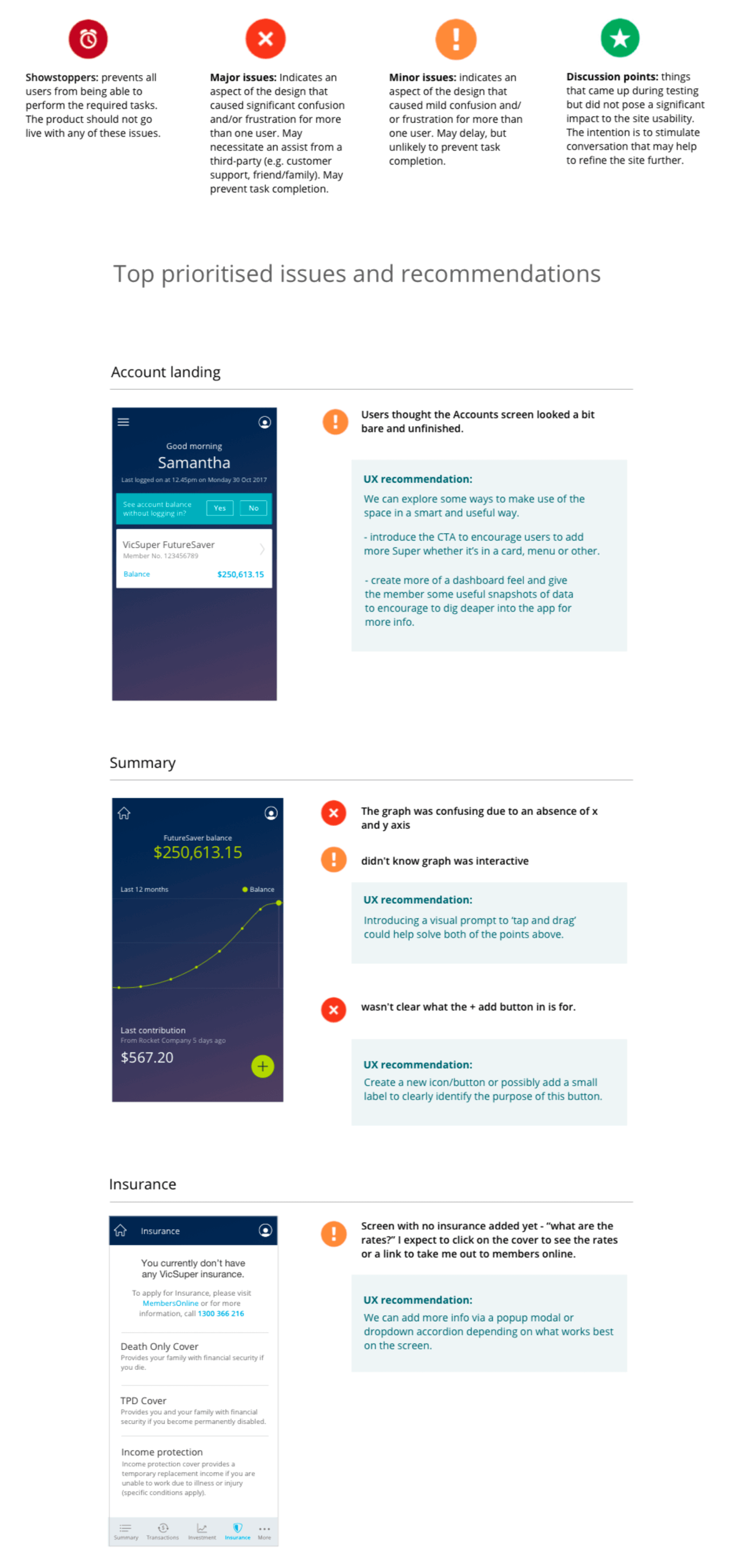
I tested the prototype with 6 people to validate assumptions, identifying usability issues and areas of improvement.
I also measured users attitude towards the whole experience of the app so we had a baseline to measure against for future testing. I used Visual Analogue Scale and out of the total users tested the average score was quite high at 7.15 out of 10.
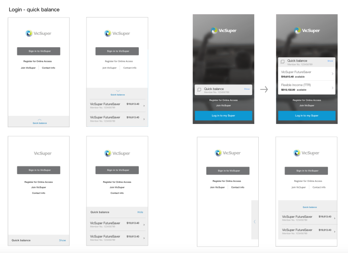
Validating the 'quick balance' feature
Accessing the members account balance was a key task so we looked at making it viewable without logging in.
Looking at well known financial institutions and how they approached it, we explored ideas on how we should visually display this.
Mixed views came out of the usability testing regarding quick balance but we didn’t have sufficient data to make a definitive decision. As the top financial institutions were using this feature we decided to build it quickly and would look at user feedback down the track to measure the value for VicSuper customers.
The visual language
Defining the style had some challenges. We had to think about the big picture, for example the broarder VicSuper digital brand as it was slowly evolving and not yet defined. Other projects were already in progress so we had to think about alignment and consistency along the way.
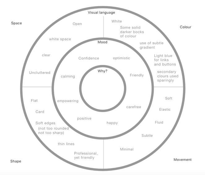
Defining the visual language
Using an inception diagram helped us define the visual language and it also helped the business understand our thoughts for the visual design direction.
Iconography
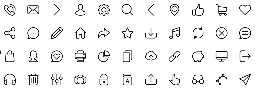
After determining the overall visual language, we followed a minimalist approach and having a slightly softer rounded feel with no fill.
I conducted some quick lean activities to help validate the core icons, showing people outside of the project the icons out of context and asking them to interpret their meaning. This helped assess whether the icons were clear, intuitive, and easily understood. We also added text labels to help with accessibility.

UI coherence via a UI style tile
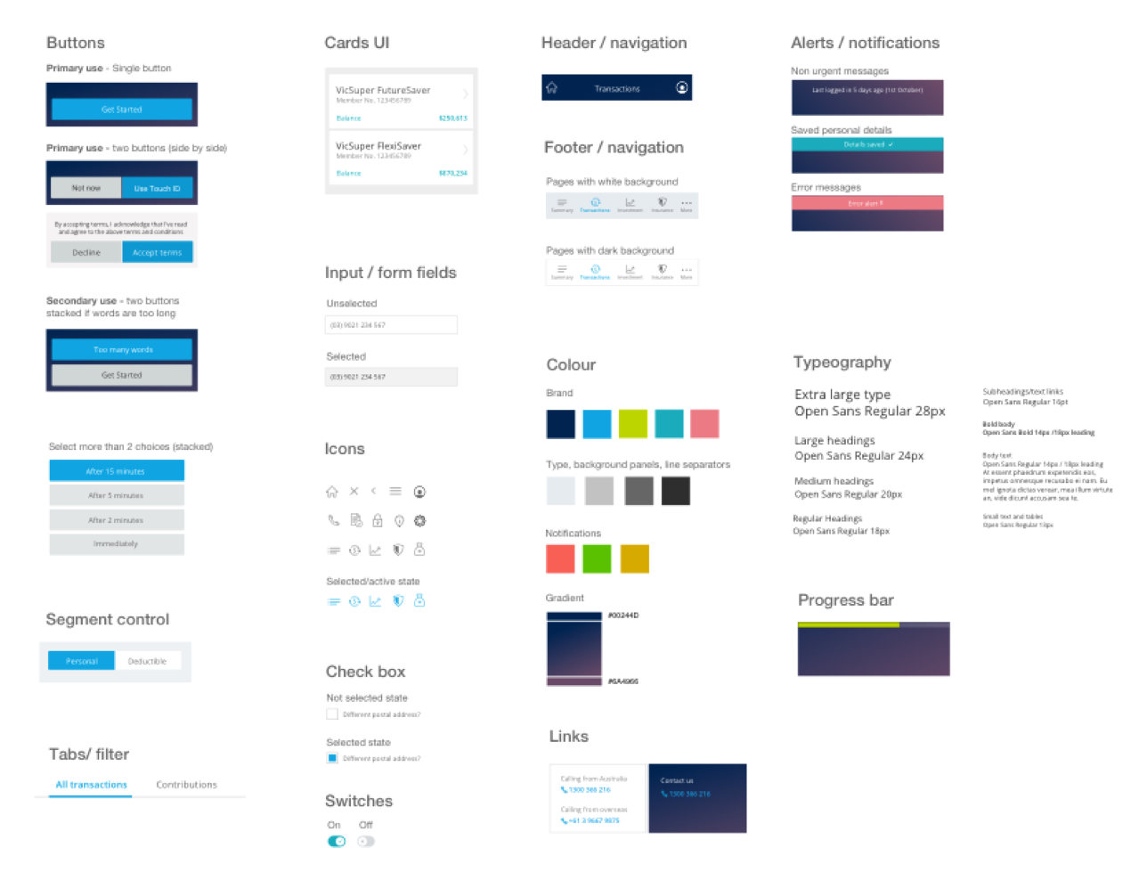
I created a tyle tile to help visualise all the elements in the app together and make sure we had a unified and cosnistent look and feel.
One example - to maintain a consistent feel across the whole app we softened sharp corners and edges of components and elements.
The extra details
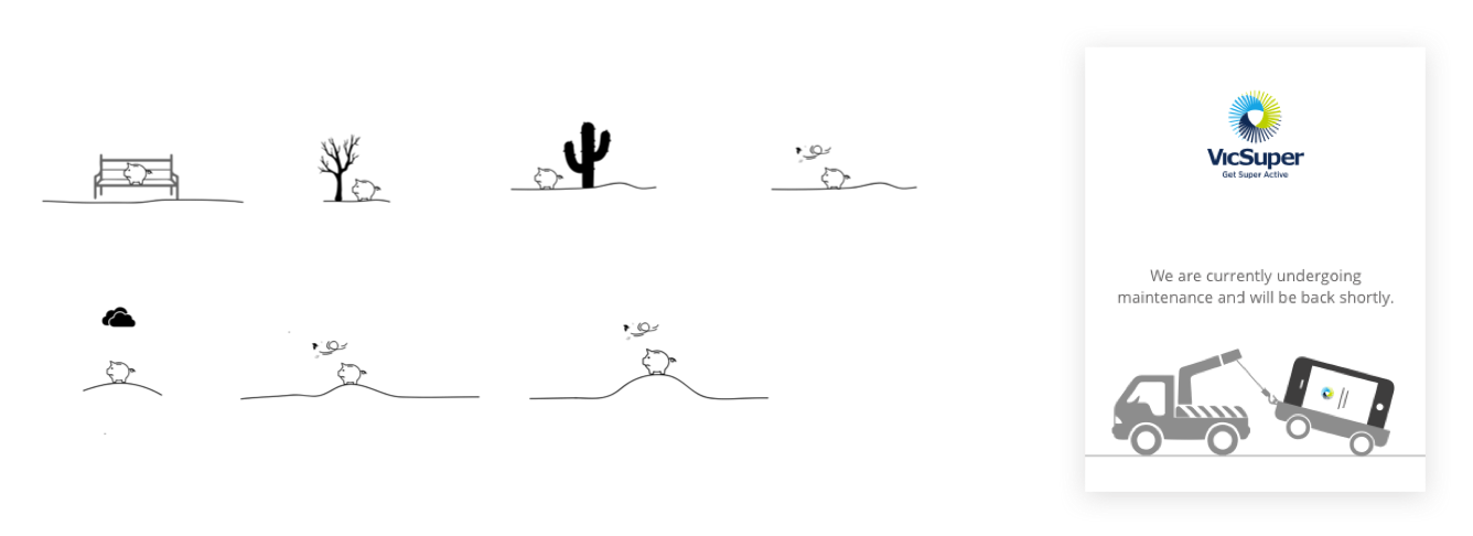
I looked at where we could add touches of delight. Little details such as animations and subtle, fluid transitions between screens were important to help enhance the whole experience of the app

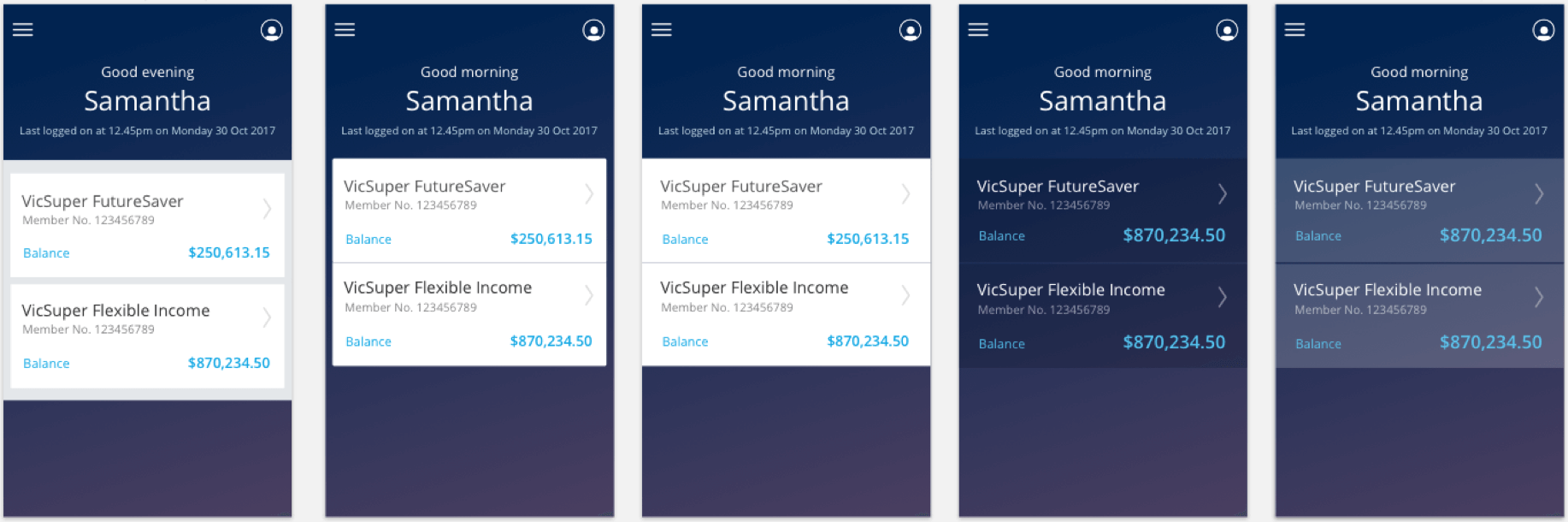
Exploring the 'account' screen
Before finalising the UI mockups for development, it was important to focus on some of the key user tasks and explore UI alternatives along with 'hallway' guerrilla testing before handing over to the engineering team.
Account screen – As this was the fist screen the user arrived on to get a snapshot of their accounts and balance, we spent a bit of time exploring design ideas eg how we show and visually treat the account info.
After lots of mockups and quick testing, we narrowed it down to a lighter treatment for the account view and treated it as a card tile rather then a more flat design approach. This card design had better affordance and felt like something the member would be more inclined to click on to take them into the selected account.
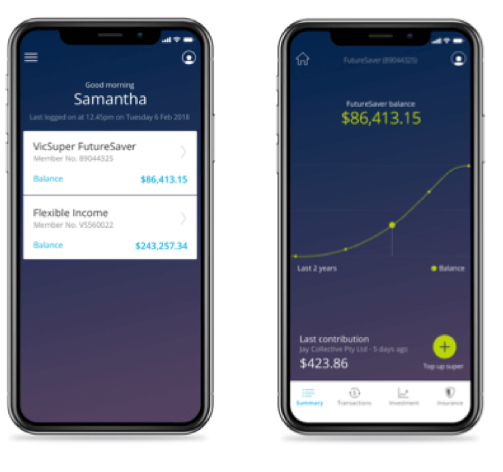
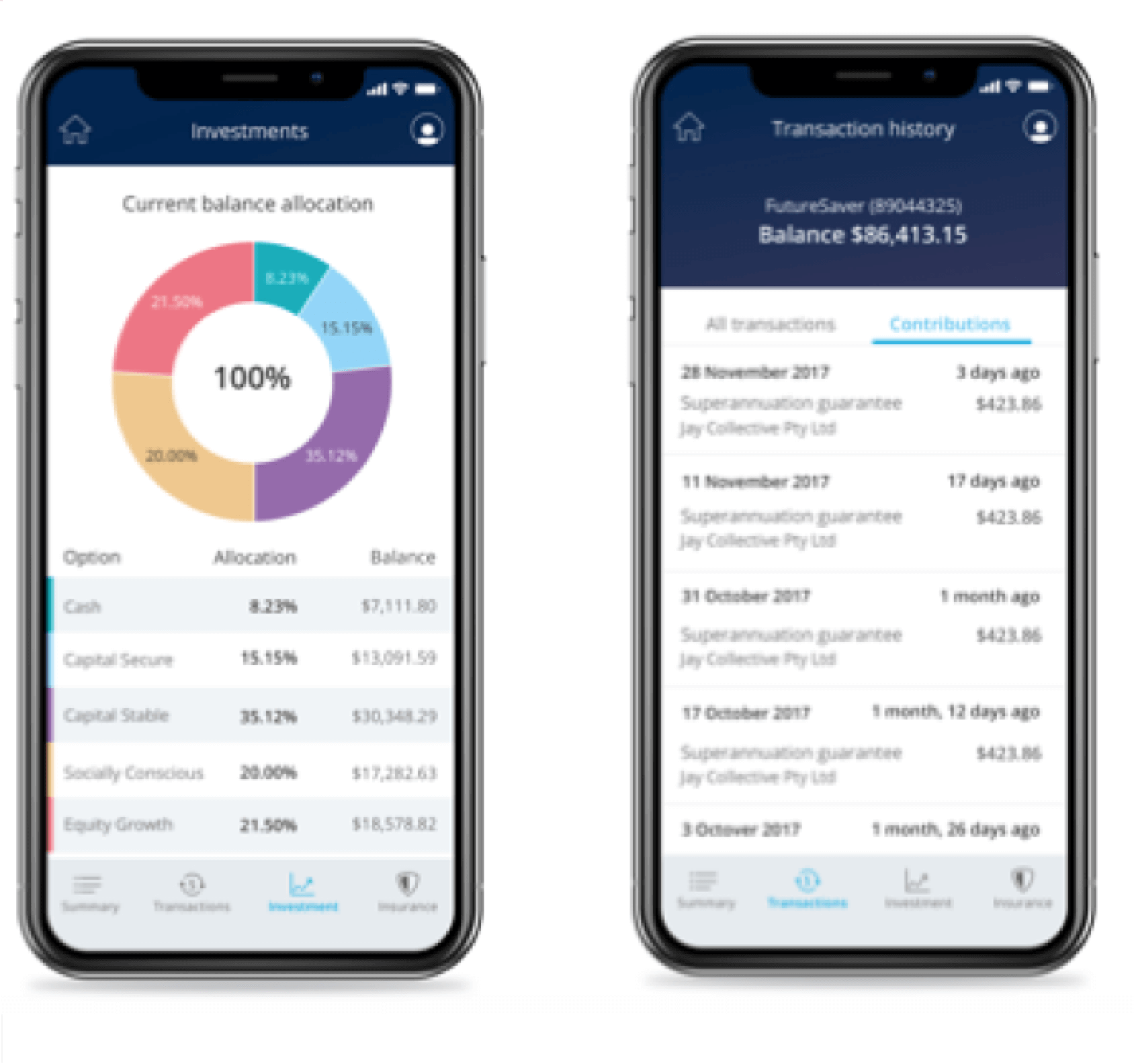
Final UI mockups
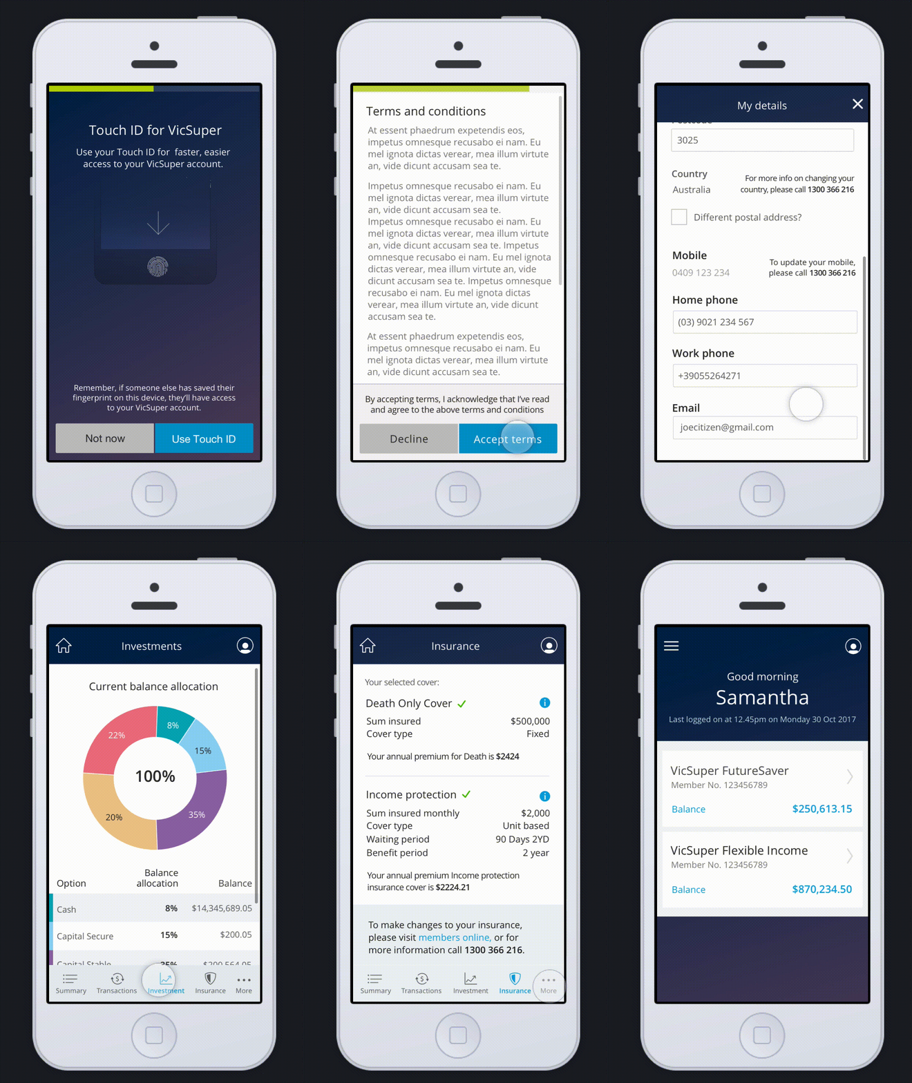
Shown here are four key screens mocked up for the phase 1 MVP release.
Working in parallel with devs
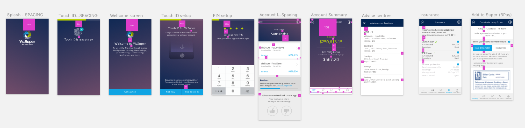
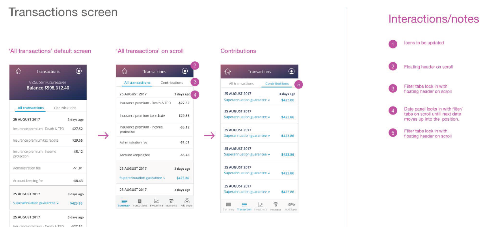
Working in parallel with the developers was critical in helping maintain the integrity and consistancy of the design.
I made sure I was available to sit down with the front end developers as often as possible to work through UI defects, help understand interaction design and tidy up the UI styling.
I’d love to chat about how I can help you. Say hi over email.