PRODUCT DESIGN / UX / UI
___
Australasian College
for Emergency Medicine (ACEM)
CPD portal
Who is ACEM?
The Australasian College for Emergency Medicine (ACEM) is the peak body responsible for training emergency physicians and advancing emergency medicine in Australia and New Zealand. ACEM sets the standards for professional education, training, and assessment of emergency doctors, and plays a key role in promoting quality care, research, and policy development in emergency healthcare.
My role
My role focused on a re-design of the portal – enhancing the portal's UX/UI by improving accessibility, usability/creating a more intuitive platform and refreshing the UI and visual design. The aim was to support and help busy medical professionals in efficiently navigating their ongoing learning and development.
Tools used
"I've noticed a large increase in CPD logging by colleagues since transitioning to the new portal. The system works well and is much more intuitive."
— CPD Portal User
Snapshot of key outcomes
Early user feedback indicated the redesigned portal streamlined key tasks and improved overall user satisfaction.
Most users agreed that CPD logging was easier, progress tracking was simpler, and the redesigned interface improved their experience.
Reduced the number of steps required to log a CPD activity by approximately 30%, creating a faster and more efficient workflow.
Refreshed the portal with a modern, intuitive and WCAG-compliant interface, improving accessibility and usability.
Increased CPD log completion rates by an estimated 15–25%, supported by user feedback and industry benchmarks.
The design process
With a tight deadline, I set out to understand both the product and the users to guide the portal design update.
Talking with the team, stakeholders, and users was crucial to creating a new portal that improved the CPD experience for medical practitioners. The goal was to streamline tasks, allowing them to track their CPD more quickly and efficiently, so they can focus on what they do best – providing patient care.
- Understanding the CPD product and who the users are
- Looking at existing research conducted
- Defining user goals, needs and pain points along with business objectives
- Quick lean research - ux survey to gathered some fresh insights
- interviews with medical practitioners
- Created wireframes - based on requirements. SME knowledge and research
- Created an interactive prototype to test with users - feedback sessions
- Insights from research to help inform design solutions


Stakeholder discussions / discovery
I held discovery sessions with stakeholders to gain a clear understanding of the business goals and objectives, as well as their perspective on user needs, pain points and operational constraints.
Combining these perspectives helped identify where user needs aligned with business priorities and where there were opportunities to improve the overall experience.
This involved identifying the primary user groups, their goals, needs and frustrations, alongside the key pain points from the business perspective.
Challenges I had to navigate
The project presented a number of challenges from the outset:
- A large backlog of over 100 requirements
- Complex workflows spanning multiple user scenarios
- Requirements that continued to evolve throughout delivery
- Areas that required further clarification and collaborative discovery before design could begin

Understanding the problems
Quantitative and qualitative research
The team shared some user research that had been conducted a couple of years earlier. While it provided useful context, I wanted to validate key findings and build a more current understanding of the experience. To do this, I ran a UX survey to quickly gather fresh insights at scale and supplemented this with conversations with a small group of medical practitioners to better understand their day-to-day challenges.
The biggest problems to solve
Medical practitioners have limited time for Continuing Professional Development (CPD), so a key objective was to make core tasks faster, simpler and more intuitive.
Many workflows were outdated and unnecessarily complex, increasing cognitive load and requiring users to navigate multiple pages to complete simple tasks. Important information was also difficult to find.
Recording a CPD activity was one of the biggest pain points. Users found the process confusing and frustrating, often abandoning the task before completion. Improving this workflow became a key focus of the redesign.
Looking at
the journeys
To build a shared understanding of the existing experience, I captured screenshots of the current journey and walked through each step with subject matter experts (SMEs) and users.
This helped uncover how the process worked in practice, identify gaps between the intended and actual experience, and reveal the frustrations, barriers and inefficiencies within the flow.
By mapping these insights directly onto the journey, we were able to pinpoint opportunities for improvement and establish a clear foundation for redesigning the experience.


Making complexity tangible
Facilitated story-mapping sessions to break complex workflows into manageable steps and align stakeholders on a shared understanding of the experience.
Requirements gathering and Navigating ambiguity
The project began with incomplete requirements and uncertainty around several core workflows. Before moving into design, I worked closely with the Product Owner and Business Analysts to create clarity and a shared understanding of the problem.
How I approached the ambiguity
- Mapped the existing user journeys with the Product Owner to understand the current experience and identify gaps.
- Defined key user scenarios to explore how different users completed core tasks in real-world contexts.
- Clarified and prioritised the most important user tasks, balancing user needs, business goals and delivery priorities.
- Created low-fidelity user flows to visualise the experience and validate how different steps connected.
- Used impact-versus-effort thinking to prioritise opportunities within delivery constraints.
Timeline
& UX process transparency
To keep the project aligned and visible, I created a high-level project timeline within our FigJam design process board. It mapped the key phases, activities and milestones, giving stakeholders and the wider team a shared understanding of where we were in the process, what had been completed and what was coming next. This helped maintain transparency, manage expectations and keep everyone aligned throughout the project.


Design deliverables
To maintain visibility of progress and priorities, I used a shared design board to organise work across Sprint 1 and Sprint 2. Design tasks were grouped into Done, In Progress and Backlog, providing a transparent view of priorities, progress and upcoming work for both the project team and stakeholders.
What others are doing in the CPD space
Early in the project, I spoke with several medical practitioners who were also members of other medical colleges.
They walked me through the CPD platforms they used, demonstrating how they completed key tasks and highlighting what worked well and where they experienced friction.
These walkthroughs provided valuable comparative insights, helping identify opportunities to improve the experience and challenge assumptions about how ACEM's platform could better support users.


Prioritising dashboard content
To redesign the dashboard, I first needed to understand the relative importance of the information and features users needed to see. Rather than making assumptions, I created a simple workshop activity where each dashboard element was represented as a movable card. Working with stakeholders, we arranged the cards in order of importance and discussed the reasoning behind each decision.
This exercise helped establish a clear visual hierarchy, align stakeholder expectations, and ensure the most important content was prioritised within the available screen space before moving into wireframes.
Key tasks
- log in to platform
- record activity
- create PDP
- Appy for excemptions
- View of exemptions
- Progress tracking
- View how many days left in CPD year
Wire frames - moving towards a testable prototype
With the core requirements, user flows and content hierarchy defined, I translated ideas into low-fidelity wireframes to rapidly explore and iterate on potential solutions.
Focusing on structure, layout and task flow rather than visual design enabled quick feedback from stakeholders and users, helping validate assumptions and refine the experience before investing time in high-fidelity designs and interactive prototypes.


Validating designs with users
Throughout the project, I tested designs with users to validate assumptions, uncover usability issues and gather feedback. Insights from these sessions informed design decisions.
Key insights
There were mixed opinions on how My Progress should be presented, with some stakeholders preferring a familiar list view. I evaluated the trade-offs and recommended a card-based design, supported by a clear design rationale.
User feedback showed a preference for the card view on mobile, where users were more likely to check their progress. The design also provided a clearer at-a-glance snapshot while reducing visual clutter.
To address stakeholder concerns, I proposed exploring a toggle between card and list views as a potential Phase 2 enhancement, following further user testing after release.


Final UI handoff
Once the UI designs had been refined and validated, I moved them from the work-in-progress area of Figma into a dedicated Sign-off page for review by the Product Manager. This provided a clear checkpoint to confirm that the designs met user needs, business requirements and project objectives before development commenced.
Following approval, I prepared the designs for implementation by organising them within a Developer Handoff page. This included design annotations, measurements and spacing, interaction notes, links to interactive prototypes, and any additional documentation required to support a smooth and efficient build.
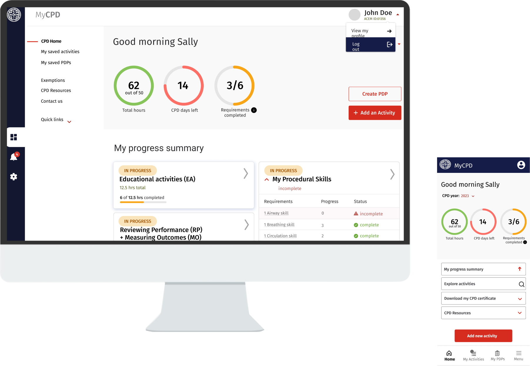
Home dashboard iterations
The dashboard evolved through multiple design iterations, with each version informed by user feedback, stakeholder input and technical considerations to improve hierarchy, usability and access to key tasks.

UAT testing & design reviews
Before each release, I reviewed the implemented designs during UAT to ensure they had been built as intended and that no important details had been missed. This included checking layouts, interactions, responsive behaviour and accessibility, identifying any inconsistencies and working with developers to resolve issues before release.


Collaboration with engineering / tech feasibility sessions
Collaboration with the engineering team began from the earliest stages of the project and continued throughout the design process. Regular discussions helped ensure proposed solutions were technically feasible, surfaced implementation constraints early, and reduced the need for costly redesigns later in the project.
Where technical limitations prevented an ideal solution, we worked together to identify practical alternatives or prioritised the work for future releases by adding it to the backlog.
Front-end collaboration
The product already had an established UI component library, so I worked closely with the development team to understand how it was implemented and where there was flexibility to refine or extend it. This enabled us to maintain consistency while improving the overall user experience.
During this process, I also identified several accessibility issues within existing components. Working collaboratively with developers, we updated high-priority components to better align with accessibility best practices, improving the experience for all users while strengthening the design system.


Edge case scenarios
I worked through edge cases with stakeholders and developers to identify exceptions, alternative user paths and potential failure points. Designing for these scenarios early helped expose gaps in the requirements and ensured the final experience was more resilient and intuitive.
Outomes
While data collection was ongoing, early user feedback indicated that improvements to the portal had significantly streamlined user processes and enhanced engagement and satisfaction.
"I've noticed a large increase in CPD logging by colleagues since transitioning to the new portal.
The system works well and is much more intuitive. Generally, very happy with it."
— CPD Portal User
Post-launch survey results:
- Easier CPD logging: Most users agreed or strongly agreed.
- Improved design: Clear consensus on the redesign’s quality.
- Better progress tracking: Users found the new system far simpler to navigate.
Refreshed the portal’s visual design, applying accessibility best practices and delivering a modern, intuitive, and WCAG-compliant user interface.
Increased CPD log completion rates by an estimated 15–25% following the redesign, based on industry benchmarks and user feedback.
Reduced steps required to log CPD activities by approximately 30%, streamlining user journeys and improving effieciency.
Received positive feedback, with 80% of surveyed users reporting the new interface was easier to use and improved their experience.
Most users agreeing CPD logging was easier, progress tracking was simpler, and the redesigned interface significantly improved their experience – directly supporting business goals of increased log completion and user satisfaction
I’d love to chat about how I can help you. Say hi over email.